


Evidence that autism rates increase with introduction of more vaccines and broader diagnostic criteria
It turns out there are inflection points and they point to real-time significant events that are inextricably-linked to the increasing autism rates

In my previous Substack article, I re-plotted the cumulative number of vaccinations (with aluminum (Al) adjuvants) data (Vaccine number according to cumulative doses (N) - y-axis) vs. autism rate data (Combined prevalence/1000 children - x-axis), and fit the data using a log-linear fit, as shown in the following graph in Figure 1. I also calculated the Pearson correlation. The Pearson correlation coefficient (R) indicated on the graph is 0.8234. This high value suggests a strong positive correlation between the two variables, meaning that as the number of vaccine doses increases, the prevalence of autism tends to increase as well.

And then I got an email from Patrick Frank - my new favorite math collaborator. He had done the work that he described that I do as a follow-up to check for inflection points. You can find his comment from my previous Substack article here.
I have since reproduced his work using trusty R, (so very superior to Excel) and let me tell you: my weird instinct to use the words inflection points was bang-on, and his work demonstrably proves it. There are inflection points and this means that there were events that cause sudden changes in autism rates. I have done my own re-hash of his work and will lay it out here - don’t worry, I will explain everything.
Let me start at the beginning.
Context
The thing I love about collaborating and transparency is that everybody sees things differently, has different backgrounds and skills. When people collaborate we all benefit from [the best of] combined skillsets and brains - two heads are better than one, right? Not only that, but we can point out each other’s mistakes. Since Patrick commented on my previous Substack article - that I should find the first (and second derivatives) of a fit function to examine the existence of true inflection points - I have done so, and this article will hopefully lay out the process and results in a clear way.
How to find inflection points: fits, first derivatives and second derivatives
Let’s go real slow. To start, the data I used to do this analysis are the autism rates from the ADDM and the total number of vaccines available for administration (by year) that 0-8 year olds would be “recommended” to take as per the CDC vaccination schedule, the Children’s Hospital of Philadelphia (CHOP) Vaccine History, Immunize.org Vaccine History Timeline, WHO and UNICEF Immunization Data, historical literature and Recent Market Reports.
Just for comparison’s sake, in the case of the original data, when the cumulative vaccines were interpolated onto the autism year - the correlation was 0.91. The Student T-test for group statistics on the new data (total number of vaccines available for administration by year for 0-8 year olds reveals that the correlation is slightly higher at 0.93. So it’s a little better.

Back to the analysis. I started with swapping the x-y axes from Figure 1 and re-plotting the data, just for visual appeal. When the axes are swapped and renamed, Number of Vaccines Available per Year becomes the x-axis, and Autism Prevalence per 1000 Children becomes the y-axis. We then get the blue points in Figure 2, right panel, below.

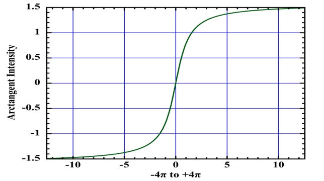
Notice that when plotted this way, the data now show two separate rises. Each rise is low, then steep, and finally followed by a flattening. This is like the shape of an arctangent function. Figure 3 shows what an arctangent looks like.
A little bit about the 2-arctan model
The 2-arctan model is better able to represent this data than the log-linear model as shown in Figure 2 (left) because a) it’s more realistic, and b) it fits better based on the differences between the observed data values and the values predicted by the fitted models.1
b) The 2-arctan model is better because its residuals pass the Shapiro-Wilk test for normality (W=0.969; p=0.893)2, whereas the log-linear model’s residuals fail the normality test (p = 0.00189 < 0.05), indicating that the 2-arctan model effectively captures the data’s actual pattern. It is complex and non-linear, and has two inflection points indicating multiple phases of growth in autism rates. For the geeks and nerds reading this, Shapiro-Wilk is the most powerful statistical method to test whether a series of values is normal (random), or not.

The equation of the 2-arctan model is as follows:
Autism incidence (y)=a+b×arctan(c×(x−d))+e×arctan(x−f), where:
a is the baseline autism rate
b and e are the amplitudes of the arctangents, controlling the height of each sigmoidal step
c is steepness of the first arctangent’s transition.
d and f are the centers of the two arctangents, roughly corresponding to the x-values of inflection points
It looks complicated but it’s not: think of it like additively stitching two sigmoid curves together to capture data dynamics properly.
a) In terms of the model more realistically representing the data, we must consider the fact that the autism rates fluctuate in time (ie: it’s not just that they exponentially grow) and this is likely due to multi-factorial reasons (like changes in autism diagnostic criteria), and not just the increasing number of vaccines on the schedule and their excipients.
Multi-factorial reasons lending to 2 phases of growth
There is an initial slow increase, a rapid rise, a leveling off, another rapid rise, and a final leveling off (again: 2-sigmoid curves to represent the 2-arctan function). The meaning behind these changes may correspond to changes in autism rates with respect (in part) to increasing numbers of vaccines, and thus increasing amounts of various and sundry excipients like aluminum phosphate, aluminum hydroxide and aluminum hydroxyphosphate sulfate. The two periods of significant increase seem to imply two sequential mechanisms of inducing autism. One at relatively lower “doses” (1 to ~12), followed by a second mechanism coming into play at higher doses (~12-19). It is undeniable that changes in autism diagnostic criteria are also playing a role in the increasing autism rates. My guess is that the first phase of growth is due primarily to the vaccine (and excipient) increases, and that the second phase of growth is due to both vaccine (and excipient) increases and broadening of autism diagnostic criteria.
N.B. I have embarked on a new project with Liz Willner that digs deeper into potential causal relationships related to particular excipients in specific vaccines. I have already created a master list of all known excipients in all vaccines, weighted their toxicity and, for now, am currently looking into who would be “worse” off according to birth year (a child would be subjected to different vaccines according to year if the CDC childhood vaccine schedule was adhered to with high fidelity). This is extremely important because the devil is in these details but for the purposes of this article, I won’t go there. This particular study simply proves two phases of growth in the context of autism rates and increasing numbers of vaccines, and thus, in my humble opinion, two mechanisms of action: toxicity of vaccines and changes in diagnostic criteria for autism.
The first and second derivatives of the 2-arctan model
Now that we have the beautiful 2-arctan model that fits our autism/vaccine data that represents 2 phases of growth, it’s time to calculate some derivatives. The first derivative of the fit function indicates the rate of change and helps to identify critical points (e.g., maxima or minima), while the second derivative determines the inflection points by identifying where the concavity changes (i.e., where the second derivative equals zero or changes sign).
The identification of the phases of rapid change in our 2-arctan model fit are much more easily identifiable when examining its first derivative (green trajectory) as shown in Figure 5 (right).

The first derivative of the 2-arctan fit represents the rate of change of the autism rate (y) with respect to number of vaccinations (x) and it’s entirely wonderful because you can really see where the changes occur when you plot the first derivative of the fit function. See the two peaks and the valley? Now here’s where it gets even better: we can calculate the second derivative to quantify inflection points. The second derivative represents the rate of change of the slope (ie: the curvature of the original curve). Inflection points occur where the curvature changes sign (ie: from concave up to concave down, or vice versa), which corresponds to points where the second derivative equals zero and changes sign.
This is also where having a very good fit to the data provides a huge advantage. The fit is noise-free. This makes the first and second derivatives of the fit smooth and noise-free as well, allowing close examination. If we were to calculate the first and second derivatives of the actual data, the noise scatter of the points would make the derivatives a jagged and uninterpretable mess. Also, the value of the Shapiro-Wilk test is very evident here. If the fit-residual consists of random values, the fit may reasonably be assumed to fully represent the data. This evident full representation provides biophysical credence to the analysis.
Isn’t this cool!? It’s kind of like finding hidden secrets in the data that we can’t see unless we do really fun math. Having calculated and plotted the first and second derivatives of 2-arctan function, we can now clearly see the 2 inflection points that represent real changes in growth with respect to the autism rates. We didn’t know that before! Disclaimer: The conclusion is based on this data (vaccines and known autism rates), and it is possible that this data could change, but know that I tried out many base data sets for vaccine data, and the results were highly repetitious. This is more an exercise based on my current data set to prove a point.
Analysis of the Graph

In the early phase (0–9 vaccinations), the autism rate remains very low (0–3 per 1,000), with minimal growth. If you’re interested to know, the list of vaccines administered during this timeframe are listed in the appendix, and this is an underestimate, if anything.3 The first derivative slope (green curve) is near 0, indicating a slow rate of change in autism prevalence. In the middle phase (9–11 vaccinations), the autism rate increases more noticeably, reaching 3.6 per 1,000 at 10.71 doses. The first derivative rises, peaking at 10.71 doses, showing acceleration in the rate of autism. Post-10.71 doses, the derivative of the first arctangent drops rapidly, indicating a negative slope and suggesting that the rate of autism increase for the lower-dose process slows or plateaus.
Lastly, in the late phase (10.71–16.6 vaccinations) with higher rates of vaccination, the autism rate again surges from ~3.6 per 1,000 at 10.71 doses to 20.57 per 1,000 at 16.6 doses and plateauing thereafter. The first derivative peaks again at ~20.57 around ~16.60 doses, indicating the second acceleration in autism rate growth rate is sharper than the first.
The two-arctangent fit models a non-linear, stepwise relationship between vaccinations and autism rate, which is more appropriate than an exponential fit due to external factors such as increased reporting efficacy or improved diagnostic measures, as previously mentioned. (I’ll come back to this, don’t worry.) For the two-arctangent model, the derivative represents the sum of the two curves, resulting in the two peaks in the green curve (at ~11 and ~17 doses). This implies several key insights about the relationship between cumulative vaccinations and autism rate, highlighting two distinct phases in the rate of autism increase.
First Phase (up to ~10.71 vaccines): A gradual rise in autism prevalence from ~0 to ~3.60 per 1,000, with the steepest increase occurring at ~10.71 vaccines, where the first derivative (rate of change of prevalence) peaks at ~5 on the right y-axis. This suggests a period where autism prevalence began to rise noticeably, possibly due to increased concentration of injected aluminum or other excipients (as per multiple vaccines administered at once).
Second Phase (~10.71 to ~16.60 vaccines): A sharper rise in autism prevalence from ~3.60 to 20.57 per 1,000, with the steepest increase occurring at ~16.60 vaccines, where the first derivative (rate of change of prevalence) peaks at ~5 on the right y-axis before declining. This indicates a second, more rapid surge in autism prevalence, possibly reflecting injury of less susceptible children with the additional amounts of excipients as per greater number of vaccines administered at once or sequentially, and importantly, possible diagnostic changes, broader criteria, or other influences.
Thus, the implication is that the data exhibits two inflection-like transitions (sigmoid steps) - not a smooth exponential or polynomial growth - suggesting distinct periods of change in autism prevalence trends. The two peaks in the first derivative fit (green curve) at ~10.71 and ~16.60 doses highlight periods of maximum change in autism prevalence, potentially aligning with historical shifts (ie: more aluminum, diagnostic criteria changes, vaccine schedules). I’ll discuss this soon.
During the steep parts of the arctan curves (e.g., 9–10.71 and 12–16.60 vaccines), small increases in cumulative vaccinations correspond to large increases in autism rate, suggesting a strong local correlation. For example, the autism rate rises from ~0 to ~3.60 per 1,000 between 9–10.71 vaccines and from ~5 to ~20.57 per 1,000 between 12–16.60 vaccines. In flat regions (e.g., 0–9 vaccines), the correlation weakens as the autism rate changes little, remaining below 3.60 per 1,000 with additional vaccinations. The fit suggests that vaccinations are associated with increasing autism rate over the entire period, even though the relationship isn’t uniform, which could be explained by other factors.
The relationship certainly appears to be biphasic. If one presumes a biological mechanism then three possibilities emerge most directly.
Cohorts of children display different intrinsic susceptibilities to injury, i.e., more susceptible ranging to less susceptible.
The cohorts are not all-or-none injured. Rather, there is a metabolic, immunologic or genetic, or other moderating factor that deterministically governs susceptibility, per each child.
Increasing vaccination doses then cause increasing rates of injury. The more vulnerable among the susceptibility range of children would be increasingly injured as the dosage number of vaccinations increases. After ~10.71 vaccines, whatever protective mechanism this cohort of children possesses is increasingly overcome and the injury curve rises to saturation. By ~12 vaccines, this cohort of children is endemically injured.
After ~16.60 vaccines, a second cohort of children, more resistant than the first, begins to sustain observable injury. Their demographic rise in injury sits atop the continuing endemic injury of the primary, more susceptible, cohort. The injury of this second cohort then very rapidly rises to near endemic saturation over the course of ~16.60 to ~18 vaccines.
It's possible this second, more resistant, cohort could have been sub-clinically injured by the lower doses of vaccine. In this scenario, the vaccines past 16.60 would then bring the increased severity of their injuries into clinical notice.
All children exhibit the same range of susceptibility to injury, but the formulation of vaccines changed around 2002 to one that is more harmful. Again, the more vulnerable in the range of children would have been injured at the lower doses. Injuries increase over the past rate with the number of doses, but now because the vaccines would have become more toxic.
If the vaccines suddenly became more toxic, the prior saturated state of the rate of injury would be overcome and a greater injury rate would suddenly appear. As the data are a time-series, the new higher injury rate would appear as a step function subsequent to the prior rate.
There are two mechanisms of injury. The second one initiates around 10.71 vaccines and peaks at 16.60 vaccines. Again, in this case, all children are assumed to have a consistent high-to-low range of susceptibility to injury.
In this case, one would again observe a step function in the rate-of-injury time-series, which would mark the activation of mechanism two.
Ultimately, the fit models two major transitions in growth rate of autism, with inflection points around 10.71 and ~16.60 vaccines marking the periods of rapid increase, aligning with the derivative peaks at these points.
N.B. The graph’s rates (~4 per 1,000 at 12 vaccines, ~22 per 1,000 at 19 vaccines) align closely with ADDM data (2014: 16.8, 2022: 32.2), though slightly higher, possibly due to the model’s fit. The graph’s arctan fit focuses on autism rate vs. cumulative vaccines reflecting autism trends rather than shot trends. This implies that autism prevalence may be associated with vaccination counts during specific periods, but the stepwise nature suggests other factors (ie: diagnostic changes) may drive the surges.
The flattening of the arctan model around 19 vaccines suggests autism prevalence may stabilize (~25 per 1,000), potentially reflecting a diagnostic ceiling4 rather than a vaccine effect, indicating that the rate of increase in autism prevalence slows as the number of vaccines approaches this level. It’s important to note that potential role of the COVID era’s impositions on everything from diagnosis (reduced access to pediatric and developmental services) to reduction of regular vaccine administration did not appear in the autism time-series. Autism prevalence continued to rise post-COVID, even if diagnostic delays did occur.
To argue that the flattening around 19 vaccines is due to a vaccine effect, we need to show that the stabilization of autism rates at ~22 per 1,000 is a direct result of the exposure to vaccines (aluminum adjuvants and other excipients), rather than diagnostic or external factors. The autism rate rises from ~4 per 1,000 at 12 vaccines to ~22 per 1,000 at 19 vaccines, but the derivative drops sharply after ~16.60 vaccines, suggesting that the rate of increase slows dramatically (rather, the negative derivative shows that the slope has become negative, marking the transition toward saturation).
If we hypothesize that aluminum exposure from vaccines contributes to autism, the flattening at 19 vaccines could indicate that the cumulative aluminum load has reached a point where further vaccines do not significantly increase the risk of autism, as the neuro-inflammatory response may have reached a maximum effect, for example. This could imply that cumulative aluminum exposure has reached a level where its impact on autism prevalence diminishes, supporting a vaccine effect where the body’s response (ie: neuro-inflammatory or immune-mediated mechanisms) plateaus after a certain exposure threshold. It’s also worth noting that the autism rate’s stabilization at 22 per 1,000 aligns closely with the vaccine count, not a specific time period tied to diagnostic changes. If diagnostic changes were the primary driver, we might expect the flattening to occur at a specific prevalence level regardless of vaccine count, but the plot ties the plateau to the vaccine threshold of 19, supporting a vaccine effect interpretation. I am open to further suggestions as to why we’re seeing this behaviour in the model.
So what’s going on in reality at these inflection points and what induced these changes in autism rates?
The most important conclusion of this analysis (based on the subject matter) lies in when the inflection points occur. As shown in the plot, at ~10 and ~14 vaccines, the autism rates are approximately 3 per 1,000 and 10 per 1,000, respectively, with rates reaching ~22 per 1,000 by 19 vaccines. The first derivative peaks at ~5 around 10 vaccines and ~5 around 16.60 vaccines, highlighting periods of maximum rate of change in autism prevalence. If we go back to our original raw data, we can easily assign the specific years from the autism data to determine when the inflection points occur.

The dates that correspond to the inflection points are 19975 and 20166 that correspond to (10.71, 3.6) and (16.6, 20.57), as per Figure 7. N.B. The trough at 2002 with corresponding points (12, 6.6) is not an inflection point: it is the point where the arctan models ‘connect’ and thus there’s a spot where the two arctangents’ slopes cancel each other out: the local minimum.
Corresponding events in 1997 and 2016
The period between 1997 and 2016 saw significant changes in childhood vaccine schedules, the use of aluminum adjuvants, autism diagnosis criteria, and related policies.
1997 Inflection Point (~11 vaccines, 3.6 prevalence)
Prior to 1997, autism prevalence was low and stable, around 1 per 1,000 in the early 1990s. The U.S. vaccine schedule expanded in the late 1990s, with the introduction of the pneumococcal conjugate vaccine (PCV7, 2000) and continued use of aluminum-adjuvanted vaccines like DTaP (diphtheria, tetanus, pertussis). By 1997, children received approximately 2-3 aluminum-adjuvanted vaccines by age 2, contributing to a cumulative total of 11 vaccines as shown in the graph. The first derivative (green line) begins to rise, indicating an increasing rate of autism prevalence.
Autism Diagnosis: The DSM-IV (1994) and DSM-IV-TR (2000) broadened autism criteria, increasing awareness and diagnosis rates. This may have contributed to the initial rise in prevalence around 1997.
Conclusion: This inflection point marks the start of a steeper increase in autism prevalence, potentially influenced by rising aluminum (and other excipient) exposure from vaccines and expanded diagnostic criteria.
Period Between 1997 and 2016
From 1997 to 2016, autism prevalence rose steadily. By 2006, the cumulative number of vaccines reached 16, with an autism prevalence of 9 per 1,000. The vaccine schedule had expanded further, adding vaccines like the rotavirus vaccine (2006), often containing aluminum adjuvants. By the mid-2000s, children received up to 4-5 aluminum-adjuvanted vaccines by age 2. The first derivative (green line) peaks around this period, indicating the fastest rate of increase in autism prevalence, though 2005 is not marked as an inflection point but rather close to the local minimum. The DSM-IV (1994) and DSM-IV-TR (2000) further refined autism spectrum disorder (ASD) criteria, including Asperger’s syndrome, leading to more diagnoses until the DSM-5 (2013). Public awareness and early intervention programs also grew, boosting identification.
This period shows a consistent upward trend in both autism prevalence and cumulative aluminum (and other excipient) exposure, driven by vaccine schedule expansions and broader diagnostic criteria.
2016 Inflection Point (~16 vaccines, 21 prevalence)
From 1997 to 2016, autism prevalence continued to climb, reaching 18.5 per 1,000 by 2016, with the cumulative number of vaccines at 16. The vaccine schedule remained relatively stable in terms of aluminum-adjuvanted vaccines, with children receiving around 4-5 by age 2 (e.g., DTaP, Hep B, Hib). However, the cumulative aluminum exposure increased as vaccination rates rose. The first derivative begins to decline after its peak earlier in 1997, indicating a slowing rate of increase in autism prevalence by 2002.
Autism Diagnosis: The DSM-5 (2013) consolidated autism diagnoses into a single ASD category, removing Asperger’s as a separate diagnosis. This may have slightly altered prevalence trends, though increased awareness and screening likely drove higher rates.
Conclusion: This inflection point suggests a potential plateau or slowing in the rate of autism prevalence growth, despite continued high aluminum exposure. It may reflect saturation in diagnostic improvements, a leveling off in vaccine schedule changes, or even biological saturation of aluminum accumulation.
N.B. The body may reach a saturation point for aluminum retention, beyond which additional exposure has diminishing effects on neurodevelopment. Aluminum from vaccines is primarily taken up by macrophages at the injection site, transported to lymph nodes, and slowly excreted via kidneys. Studies (e.g., Flarend et al., 1997) show that only a small fraction of injected aluminum accumulates in the brain (about 0.1–1%) (of course, this result is when the injection is properly intramuscular. What happens if (or when) a vessel is penetrated? Could the autism rate reflect the rate of blood vessel penetration during injection? Would the increasing incidence of autism then reflect a decreasing incidence of care and attention during injection?). If aluminum were neurotoxic in a way that contributed to autism, the brain’s aluminum levels might plateau after a certain exposure threshold, limiting further impact. By 2016, with cumulative exposure already high (16 vaccines), additional vaccines may not significantly increase brain aluminum levels, leading to a plateau in any hypothetical effect on autism prevalence.
It will be very interesting to find out how other excipients are affecting the autism rates.
Conclusion: The inflection points in 1997 and 2016 highlight key shifts in autism prevalence trends, potentially influenced by the cumulative number of vaccines (some of which are aluminum-adjuvanted and others contain many other toxic excipients) (increasing from 11 to 16 over the period) and evolving diagnostic criteria. The 1997 point marks the beginning of a significant rise, while 2016 indicates a slowing trend. The period between, including 2006 (16 vaccines, 9 prevalence), shows a steady increase driven by vaccine schedule expansions and diagnostic advancements. The graph suggests a correlation between [aluminum-adjuvanted] vaccines and autism prevalence.
Here’s some more details about changes in aluminum-adjuvanted vaccines.7
Aluminum is neurotoxic, by the way.89101112 (At a long-ago conference in Inorganic Biochemistry at Oxford, R.J.P. Williams -- a very original thinker -- observed that aluminum had no biological chemistry. It was only toxic. It's naturally in all our food. The reason it doesn't kill us is that the silicate also in our food complexes the Al and makes it insoluble. It passes right through us. A illustrative little side-note. Injected Al by-passes the safety mechanism.)
This raised aluminum adjuvant exposure from approximately 2–3 mg to 4.225 mg in the first year of life, driven by vaccines containing aluminum hydroxide or phosphate (e.g., HepB: 250–500 μg per dose, PCV: 125 μg per dose) is concerning to me. On the autism side of things, autism diagnostic criteria and prevalence also changed dramatically. In 1990, autism was defined narrowly under DSM-III-R, with a prevalence of 1 in 2,500 to 1 in 10,000, and it’s possible that autism was under-diagnosed due to limited tools and awareness, but I don’t think this explains the autism rate increases. I don’t think anything is attributable to any one thing.
Bottom line for now
In the context of changes in autism rates, an inflection point refers to a specific moment or period where the rate of change in autism prevalence (ie: aluminum amounts increasing/hitting neuro-inflammatory maximums/biological saturation of aluminum accumulation/diagnostic criteria changes) shifts significantly. So I would hypothesize that the first phase of growth in autism rates leading up to 1997 was due to increased amounts of aluminum (and other excipients) in vaccines administered in combination (ie: more vaccines being administered at once and getting on the schedule), and the second increase in the rate of change of autism prevalence leading up to 2016, was due to both vaccine effects and broadening of autism diagnostic criteria (with a very wide range of what comprises ASD).
So, what do you think?
I apologize for taking so long on this article: much on the go. Please feel more than free to comment and point out typos and/or errors. And as always, keep telling the truth loudly.
The 2-arctan model fits better than the log-linear fit based on the Shapiro-Wilk test results (W = 0.768, p-value = 0.002: residuals may not be normally distributed (p <= 0.05) vs. W = 0.966 , p-value = 0.672: residuals are consistent with normality (p > 0.05)). Residuals are the differences between the observed data values and the values predicted by the fitted model.
The Shapiro-Wilk test (W = 0.969, p = 0.893) indicates that the residuals of the 2-arctangent model are normally distributed, suggesting a good fit to the data.
Smallpox (Dryvax, Wyeth) Pertussis (Whole-Cell, Lederle) Diphtheria Toxoid (Lilly) BCG (Tice, Organon) Tetanus Toxoid (Parke-Davis) DTP (Wyeth) Polio (IPV, Salk, Lederle) Measles (Edmonston B, Merck) MMR-II (Merck) Pneumovax 23 (Merck) HepB (Recombivax HB, Merck) IPV (IPOL, Sanofi Pasteur) Typhoid (Vivotif, PaxVax) Hib (PedvaxHIB, Merck) Varivax (Merck)
A diagnostic ceiling refers to a limit in the observed prevalence of a condition (like autism) due to constraints in diagnostic practices, criteria, or systemic factors, rather than a true biological or environmental ceiling in the condition’s occurrence. In this context, the flattening of the autism rate around ~35 per 1,000 at 60 doses could imply that the observed prevalence is reaching the maximum number of cases that current diagnostic systems can identify, rather than indicating that the actual incidence of autism (or its association with vaccinations) has plateaued. (Or sautration of susceptibility cohorts?)
The biggest change in autism diagnostic criteria in terms of expansion likely occurred with the release of the DSM-III-R in 1987. This revision marked a significant broadening of the autism concept by introducing the category of Pervasive Developmental Disorder-Not Otherwise Specified (PDD-NOS), which allowed for the inclusion of individuals who didn’t fully meet the stricter criteria for autism but still showed significant developmental challenges in social interaction, communication, and behavior. Additionally, the DSM-III-R removed the requirement for symptom onset before 30 months, enabling diagnosis across a wider age range and reflecting a growing understanding that autism could present later in development. It also shifted from "infantile autism" to "autistic disorder," acknowledging that the condition wasn’t limited to early childhood and could persist or manifest differently over time. This polythetic approach, with 16 detailed criteria grouped into three domains (social interaction, communication, and restricted behaviors), allowed for more flexibility in diagnosis, capturing a broader spectrum of presentations.
While the DSM-IV (1994) further formalized the spectrum by adding Asperger’s disorder and other subtypes, and the DSM-5 (2013) consolidated these into a single Autism Spectrum Disorder (ASD) diagnosis, the 1987 DSM-III-R was the pivotal moment for expansion. It laid the groundwork for recognizing autism as a spectrum rather than a narrowly defined condition, significantly increasing the number of individuals who could be diagnosed. This shift aligns with historical trends in prevalence data, where studies note a marked rise in autism diagnoses following these changes, often attributed to broader criteria rather than a true increase in incidence. However, this expansion also raises questions about whether the increase in diagnoses reflects over-diagnosis or better recognition, as the lack of a biological marker for autism means diagnostic boundaries remain subjective and influenced by cultural, social, and systemic factors like access to services.
The childhood immunization schedule in the United States, as recommended by the Centers for Disease Control and Prevention (CDC) and the Advisory Committee on Immunization Practices (ACIP), expanded significantly between 1990 and 2017. In 1990, aluminum-containing vaccines added to the schedule include:
DTP contained aluminum adjuvants (aluminum phosphate or aluminum hydroxide) to enhance immune response.
Hib vaccines often included aluminum adjuvants, depending on the formulation (e.g., PedvaxHIB used aluminum hydroxyphosphate sulfate).
The number of doses that children received by age 6 was approximately 10–12, with most administered in the first two years of life. The aluminum exposure from vaccines was approximately 2–3 mg total in the first year of life, depending on the specific formulations used.
By 2017, the schedule had expanded significantly, increasing the number of doses and the use of aluminum adjuvants. Key additions included:
Hepatitis B (HepB) (added in 1991 for universal infant vaccination, with a birth dose recommended), which contains aluminum hydroxide (250–500 μg per dose)
Hepatitis A (HepA) (recommended for children aged 12–23 months starting in 1999, with broader recommendations by 2006), which contains aluminum hydroxide (approximately 250–450 μg per dose)
Pneumococcal Conjugate Vaccine (PCV7, later PCV13) (introduced in 2000 (PCV7) and updated to PCV13 in 2010), whereby PCV13 used aluminum phosphate (125 μg per dose, with 4 doses recommended)
Rotavirus (RV) (added in 2006 (RotaTeq) and 2008 (Rotarix)), which did not contain aluminum adjuvants
Human Papillomavirus (HPV) (recommended for adolescents (ages 11–12) starting in 2006 for girls and 2011 for boys), which contains amorphous aluminum hydroxyphosphate sulfate (225–500 μg per dose)
Meningococcal Conjugate Vaccine (MCV4) (recommended for adolescents starting in 2005, with boosters added later), with some formulations containing aluminum adjuvants
Varicella (Chickenpox) (added in 1995, with a second dose recommended by 2006), which did not “typically” contain aluminum adjuvants
Influenza (annual flu vaccination was recommended for children starting in 2004 (ages 6–23 months) and expanded to all children over 6 months by 2010), whereby most flu vaccines did not contain aluminum adjuvants, though some adjuvanted formulations (e.g., Fluad) used other adjuvants like MF59.
The number of doses children received by age 6 in 2017 was approximately 30–36 vaccine doses, with 20–24 doses in the first two years, depending on combination vaccines and state requirements. The cumulative aluminum exposure from vaccines increased significantly due to the addition of HepB, HepA, PCV, and HPV vaccines. Studies estimate infants received approximately 4.225 mg of aluminum from vaccines in the first year of life by 2017, compared to 2–3 mg in 1990.
At 2 months, infants received vaccines (e.g., DTaP, Hib, PCV, HepB) delivering up to 172.5 μg/kg body weight of aluminum, the highest per-dose exposure in the schedule.
The total aluminum burden increased by approximately 20% after the addition of PCV vaccines in the early 2000s. Vaccination coverage rose from 50–60% in the mid-1980s to over 90% by 2017, driven by school mandates and public health campaigns. There was also a shift away from thimerosal (a mercury-containing preservative): it was phased out of most childhood vaccines by 2001 due to public concerns about mercury exposure. This shift coincided with increased reliance on aluminum adjuvants, as thimerosal-free formulations often used aluminum to maintain immunogenicity.
Vaccines like Pediarix (DTaP, HepB, IPV) and Pentacel (DTaP, IPV, Hib), introduced in the 2000s, reduced the number of injections but maintained or increased aluminum content due to multiple antigens requiring adjuvants.
Boegman RJ, Bates LA. Neurotoxicity of aluminum. Can J Physiol Pharmacol. 1984 Aug;62(8):1010-4. doi: 10.1139/y84-170. PMID: 6207901
Skalny AV, Aschner M, Jiang Y, Gluhcheva YG, Tizabi Y, Lobinski R, Tinkov AA. Molecular mechanisms of aluminum neurotoxicity: Update on adverse effects and therapeutic strategies. Adv Neurotoxicol. 2021;5:1-34. doi: 10.1016/bs.ant.2020.12.001. Epub 2021 Feb 11. PMID: 34263089; PMCID: PMC8276946
Dey M, Singh RK. Neurotoxic effects of aluminium exposure as a potential risk factor for Alzheimer's disease. Pharmacol Rep. 2022 Jun;74(3):439-450. doi: 10.1007/s43440-022-00353-4. Epub 2022 Jan 27. PMID: 35088386
Aschner M, Skalny AV, Santamaria A, Rocha JBT, Mansouri B, Tizabi Y, Madeddu R, Lu R, Lee E, Tinkov AA. Epigenetic Mechanisms of Aluminum-Induced Neurotoxicity and Alzheimer's Disease: A Focus on Non-Coding RNAs. Neurochem Res. 2024 Nov;49(11):2988-3005. doi: 10.1007/s11064-024-04214-9. Epub 2024 Jul 27. PMID: 39060769
Banks WA, Kastin AJ. Aluminum-induced neurotoxicity: alterations in membrane function at the blood-brain barrier. Neurosci Biobehav Rev. 1989 Spring;13(1):47-53. doi: 10.1016/s0149-7634(89)80051-x. PMID: 2671833
Andy Wakefield, Suzanne Humphries, Sherri Tenpenny, Christiane Northrup, and Vernon Coleman have been right all along. Wonderful doctors all.
Hi Jessica. Totally inspired by your methodology:
1. You carefully explain to us the analytical pathway you are taking,
2. You give full credit to the people you are working with and others. Your parents deserve credit for bringing up a wonderful child.