Causation: Let me count the ways
In this article, I put together a list of evidence showing a causal effect between the COVID-19 injectable products and adverse events reported to VAERS.
The first way: temporality - one of the Bradford Hill Criteria.
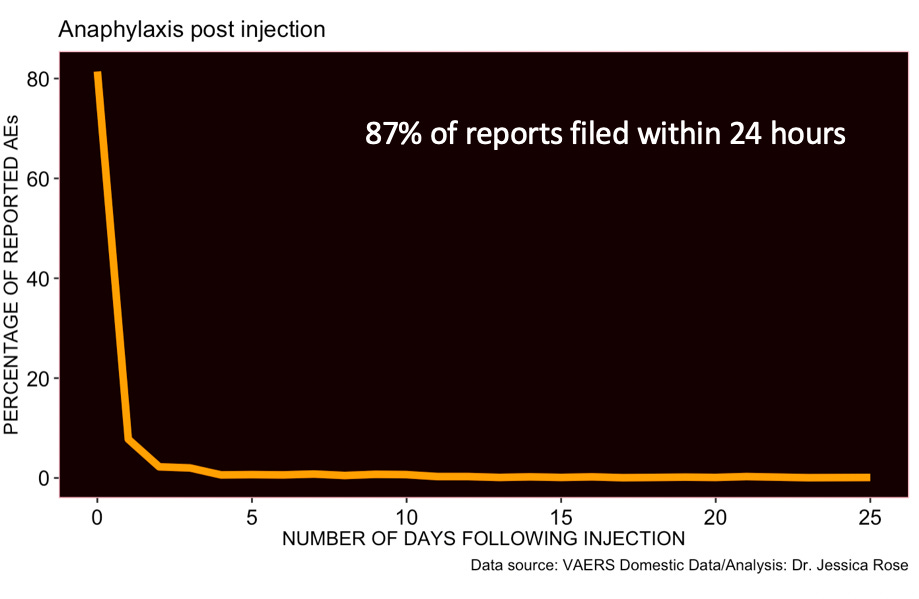
When you calculate the difference in time between the injection dates and onset of adverse event (AE) dates in VAERS for each individual, and plot these differences against the percentage of reported AEs, you get a clustering effect about 0. Although the ‘psychologic’ (the effect of clustered reporting by drawing a line from the injection to the event and thus reporting it) may explain some of this clustering, it is by no means counterproof of causation. As an example of this technique visualized, refer to Figure 1. This is a time series plot of adverse events reported for children aged 5-11 years of age in VAERS.
This is not proof of causation, but someone would need to come up with some very strong counter evidence to convince me that there’s no cause here. And as usual, I will show anaphylaxis as a positive control. Anaphylaxis is an acute reaction to a trigger. If an anaphylactic event occurs immediately following a shot, no one would debate that the shot was the cause.

The second way: dose response.
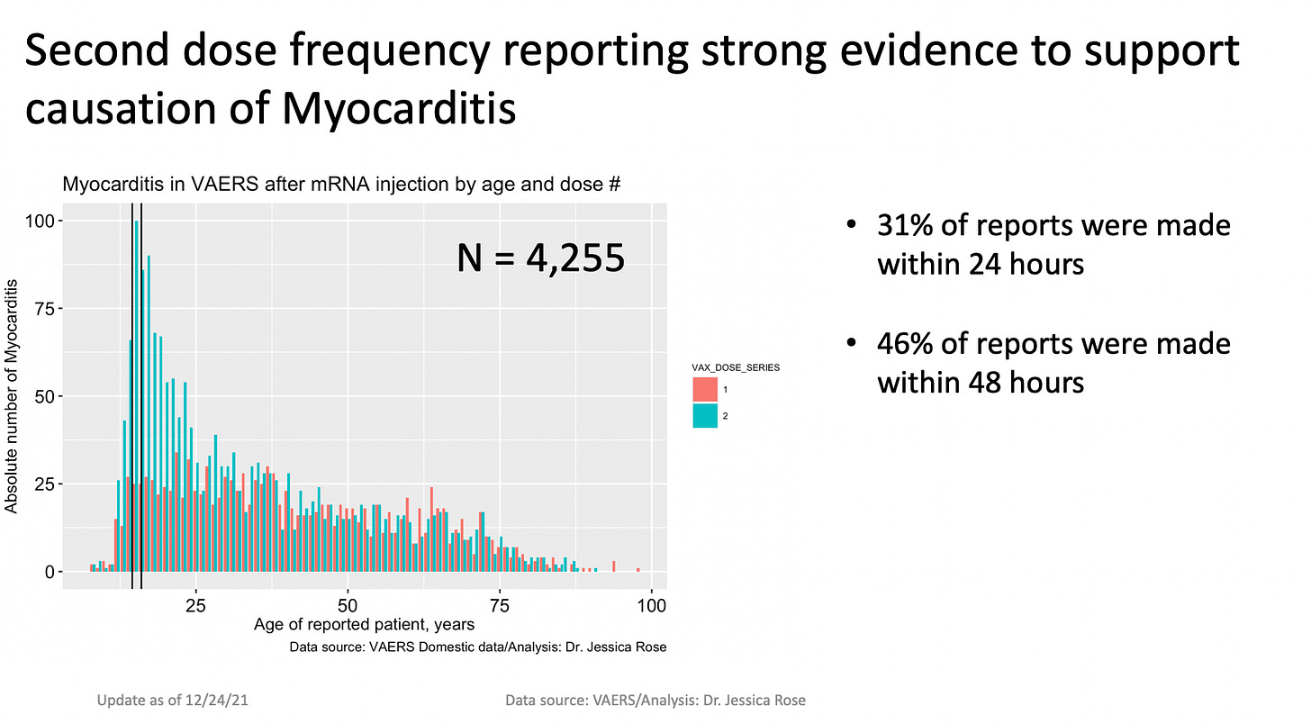
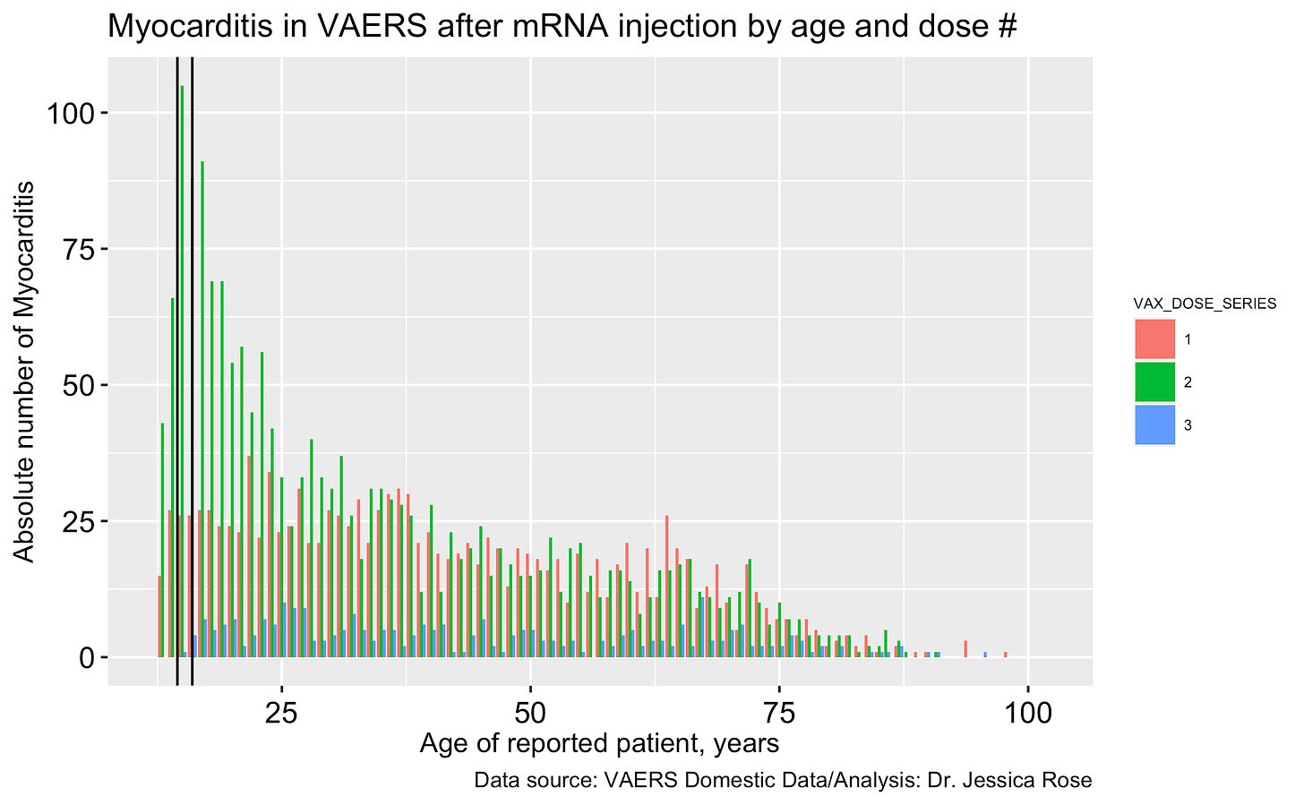
If there was no relationship between the injections and the reactions, then there should never be a difference between the reactions themselves and the doses. For example, Dose 2 should not be associated with increases in reports for a particular AE over Dose 1. But, it is. And this is very evident when one examines Myocarditis by dose and focuses on children.

I realized that I haven’t updated this fantastic figure with Dose 3 data - at all - so I decided to do so to examine the effects of Dose 3 in the context on Myocarditis. It turns out, Dose 2 remains the loo-loo dose, however, again, the fact that the reporting frequency drops to even lower than it was for Dose 1 makes the case for Dose response effect and thus, a casual effect. It is possible, however, that the Dose 3 effect is due to injection hesitancy and thus a drop in AEs subsequent to shots.

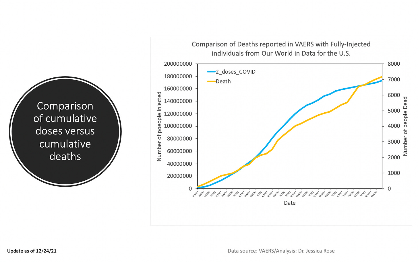
The third way: correlation plots of deaths and injections in United States.
A while ago I made a nice graph that had two trajectories plotted: one was the VAERS death reports trajectory against received date of report and one was the total deaths listed in Our World in Data. They were pretty nicely correlated. Again, not causation, but evidence of. I haven’t updated this particular plot since last December, but have no fear, even better stuff is next.

The fourth way: correlation plots of state-stratified AEs and injections in United States.
If there’s no correlation between the injections and the adverse events, then we won’t see high R values1 (goodness of fit values → if line goes through points → correlation = very YES). The higher the R-value and the lower the p-values, the more likely that the correlation exists. A 1:1 correlation under certain circumstances, may even convince one of a causal effect. Under certain circumstances. Like a shot in the arm and then death the next day. I created some scatterplots with regression lines and calculated the goodness of fit values and the p-values (which indicate the result didn’t happen by chance (when p < something low)). In more technical terms, we can reject the Null Hypothesis that there is no relationship between the variables (AEs and shots) if the p-value is minuscule.
Here are a series of scatterplots representing the numbers of Anaphylaxis, Death, Cancer, Myocarditis, Female Reproductive Issues, Thrombotic AEs including Pulmonary embolism, Disabilities and Smallpox (2019) reports per state, against the number of COVID-19 injections administered per state. I wanted to have a positive control so I selected anaphylaxis AEs and happily enough, the R-value is 0.97 (p-value == 0). This means that the number of injections per state are correlated very well to the number of AEs per state. I also wanted to have a negative control in here. I chose Smallpox vaccines from 2019 since I wanted to minimize the possibility of spurious correlations based on state population size and subsequent dose quantity distribution (and thus, AE reports). Smallpox vaccines are primarily distributed to military personnel and thus not in every state (only in 22, as a matter of fact, as per VAERS reports).
What is neat here is that no matter what you pick, a very strong correlation ensues. Death is the weakest with R=0.82 (R^2=0.67) but this is still considered a high R value and the p-value is essentially 0. The negative control Smallpox R-value is a weak R=0.31 (R^2=0.1) with a p-value of 0.16 which means that the number of AEs reported for Smallpox in VAERS and the number of COVID-19 injections administered per state are not correlated. That’s sounds logical. They shouldn’t be.
I am going to be presenting at the World Council for Health's Vaccine Causation Conference (VCC) coming up on Saturday, January 29, 2022 and I will be talking about this list of evidence derived from simple VAERS data that provides strong evidence of causation.
Prove me wrong.
Thanks to Zana for the suggestion to add Thrombotic AEs. Done.
I just want to add here that R~1 could mean two things are SPURIOUSLY correlated. Some states are bigger than others and have more people and thus more doses would be doled out to the compliant and subsequently potentially more AEs would ensue. The proportionality constant would remain the same between states. This implies that even if we checked FLU AEs from VAERS from 2019, the data would likely look perfectly correlated to the COVID-19 injection data. In fact, it does. But they are not related, in fact. Tricky, wuh?


I freaking love you, Jessica. We are so fortunate to have a data/truth/freedom warrior like you on the side of the Resistance.
You can get even better Dose response effect by comparing moderna vs Pfizer. Modern give 100mg per dose. Pfizer gives 30mg per dose.